Overview
As design lead at Portalverse, my role was to transform their technical demo of a peer-to-peer cloud gaming network into a viable product. To realise this vision, we designed two applications; a consumer app for cloud gamers and a B2B2C platform for cloud streaming providers.
For the consumer app, I started from zero and adhered to the user flow of the original technical demo. However, after connecting with our users; evidence mounted that we needed to challenge our original business logic which centred on Web3 technologies. Subsequently, we removed Web3 concepts from the user experience and ditched the expected design patterns.
At the end of the process, I created high-fidelity mockups and prototypes for mobile and desktop interfaces, supported by a comprehensive design system and component library.
What is Portalverse?
Portalverse is a decentralised rendering protocol, or put simply: a better way to stream games from the cloud. Cloud gaming is a widely recognised solution to improve the gaming experience for users by removing costly hardware requirements and allowing most devices to be used as a gaming machine, however, some of the downsides of cloud gaming are that there are often high latency issues for users and cost issues for service providers. Portalverse attempts to resolve this tension with the innovative use of decentralised technology (DePIN Web3).
In simple terms, similar to how Uber uses privately-owned vehicles to offer ridesharing, the Portalverse draws on existing hardware in the crypto-mining ecosystem to offer cloud gaming services.
Initial Research
We created a reference cohort of gamers to understand their attitudes towards cloud gaming and existing services. By testing Geforce Now and Xbox Game Pass, key insights emerged that informed our MVP features.
Key User Insights
From Web3 back to Web2
Initial Web3 Approach
Our initial version of the client app closely followed the technical demo. Users needed cryptocurrency wallets to exchange Portalverse tokens for gameplay time—similar to a classic arcade where people purchase tokens for playtime.
Gamers hated it. The onboarding exceeded 5 minutes with significant context switching across 4 distinct steps: creating a wallet, depositing tokens, exchanging tokens for gameplay, and signing smart contracts.
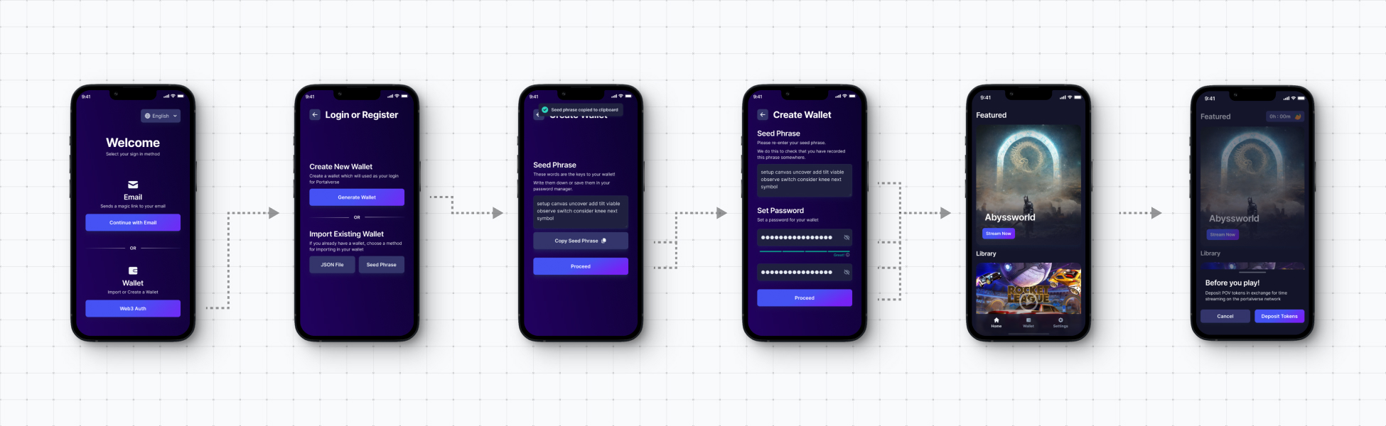
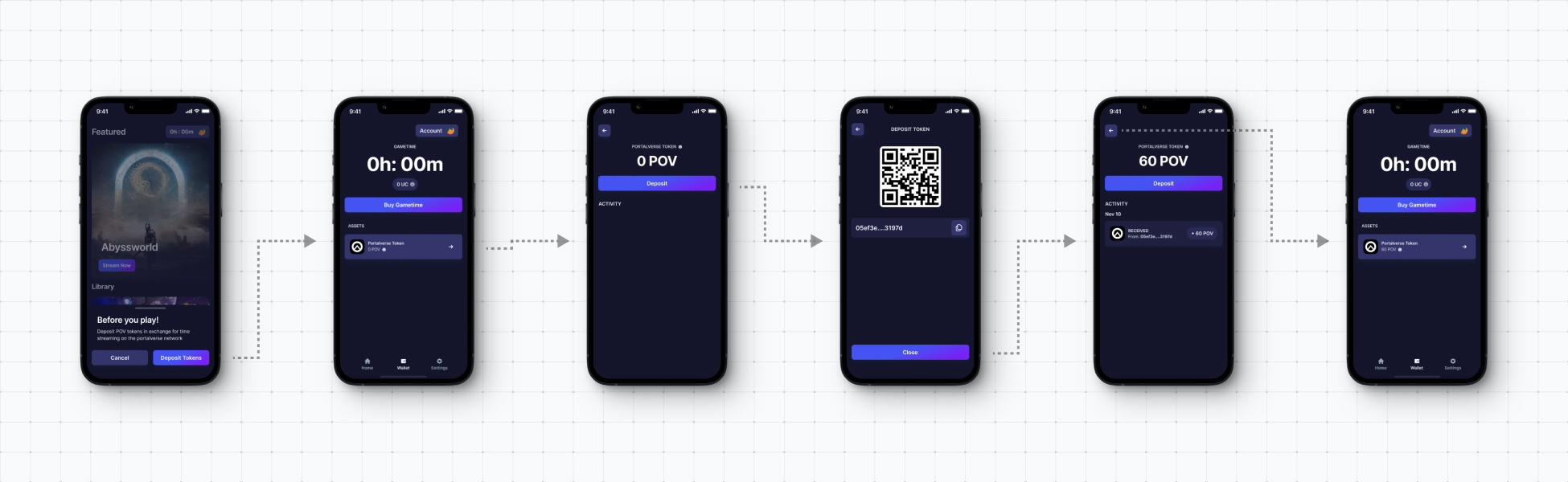
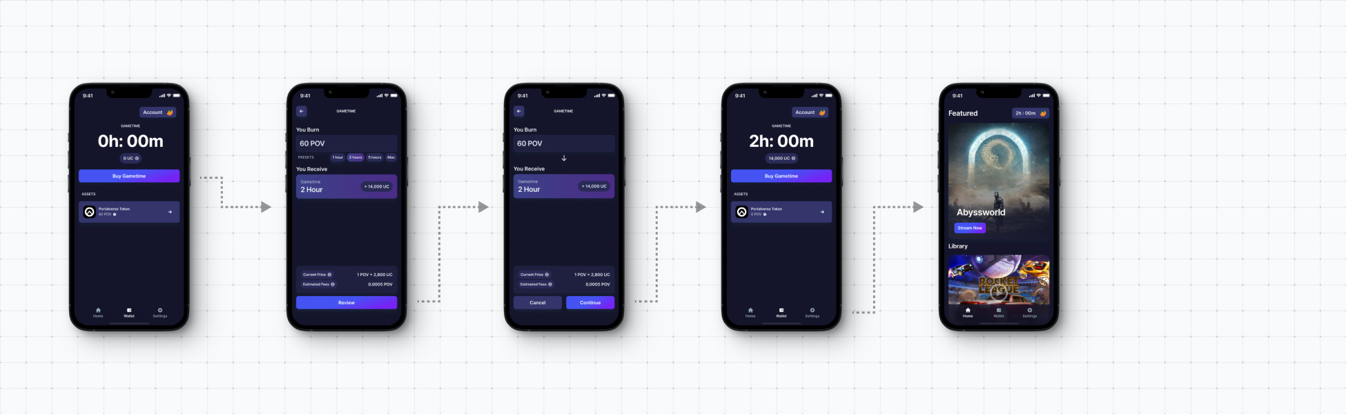
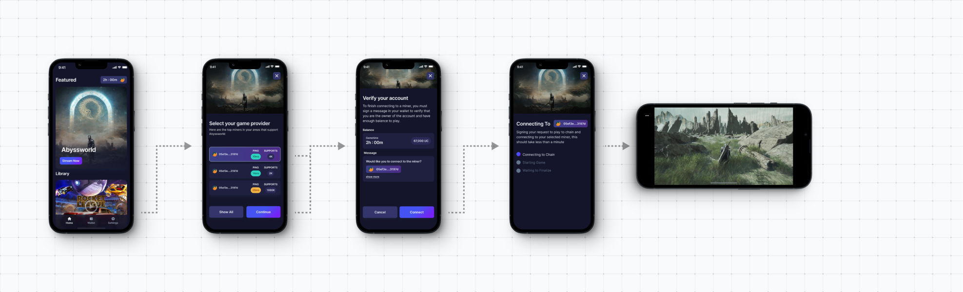
Under this design, users encountered novel concepts like seed phrases, network fees, and transaction signing. Our users universally disliked this onboarding, indicating that navigating Web3 concepts was confusing and required forced buy-in to the ecosystem.
Through testing this user flow, it materialised that users, as well as the business, would benefit from decentralised concepts being removed from client user experience, and these insights informed the design for the second (i.e Web 2) iteration.
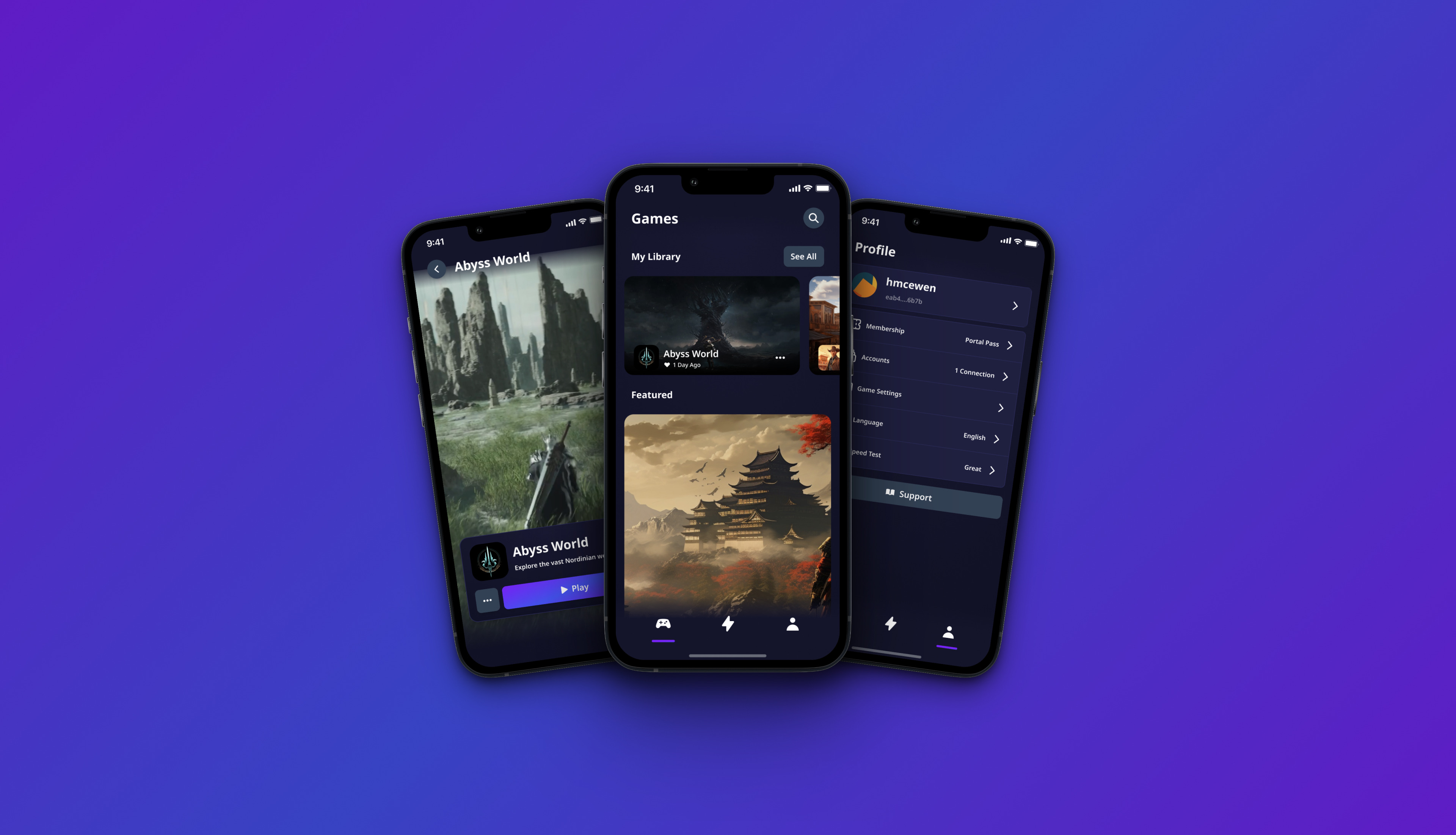
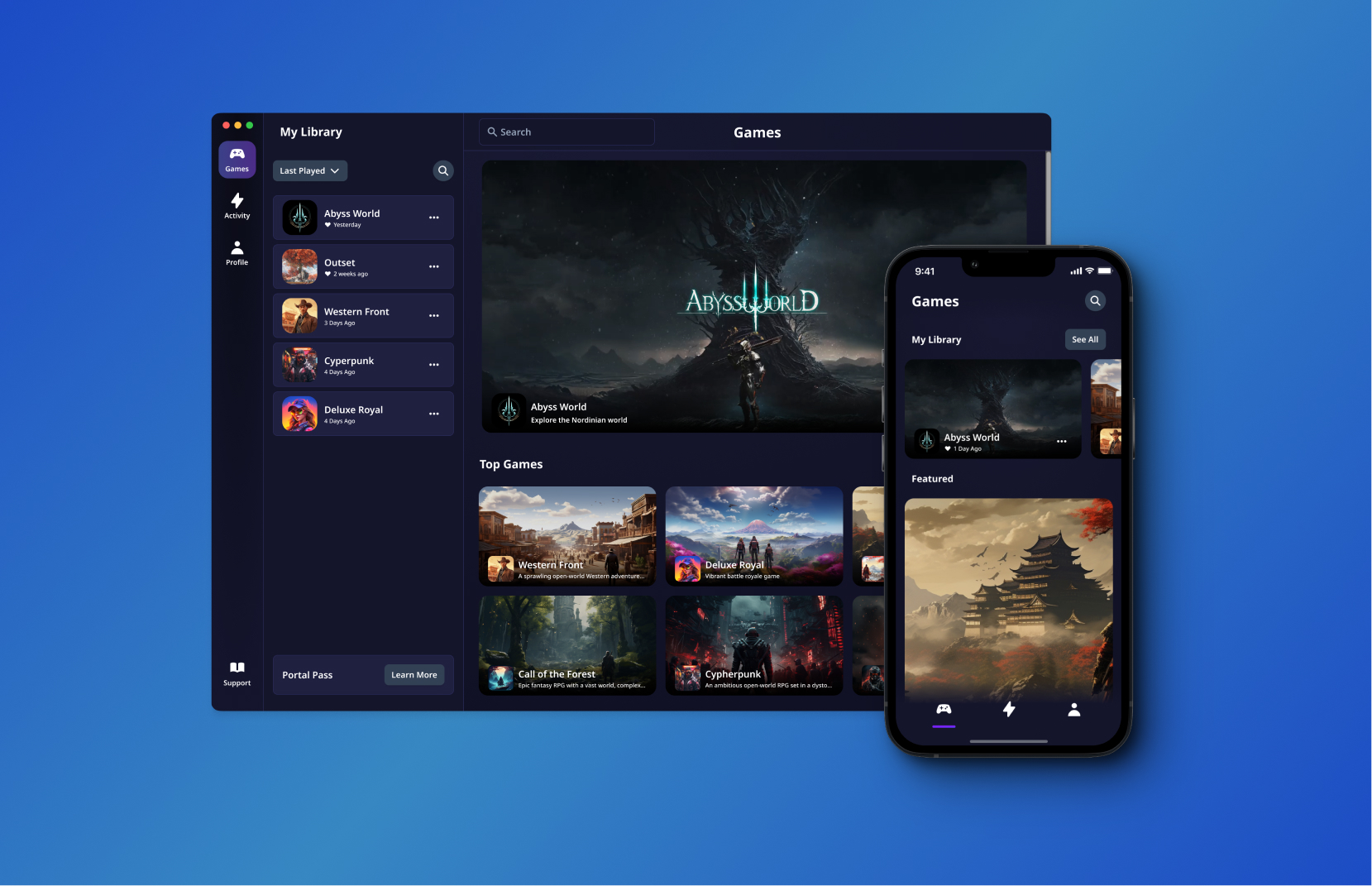
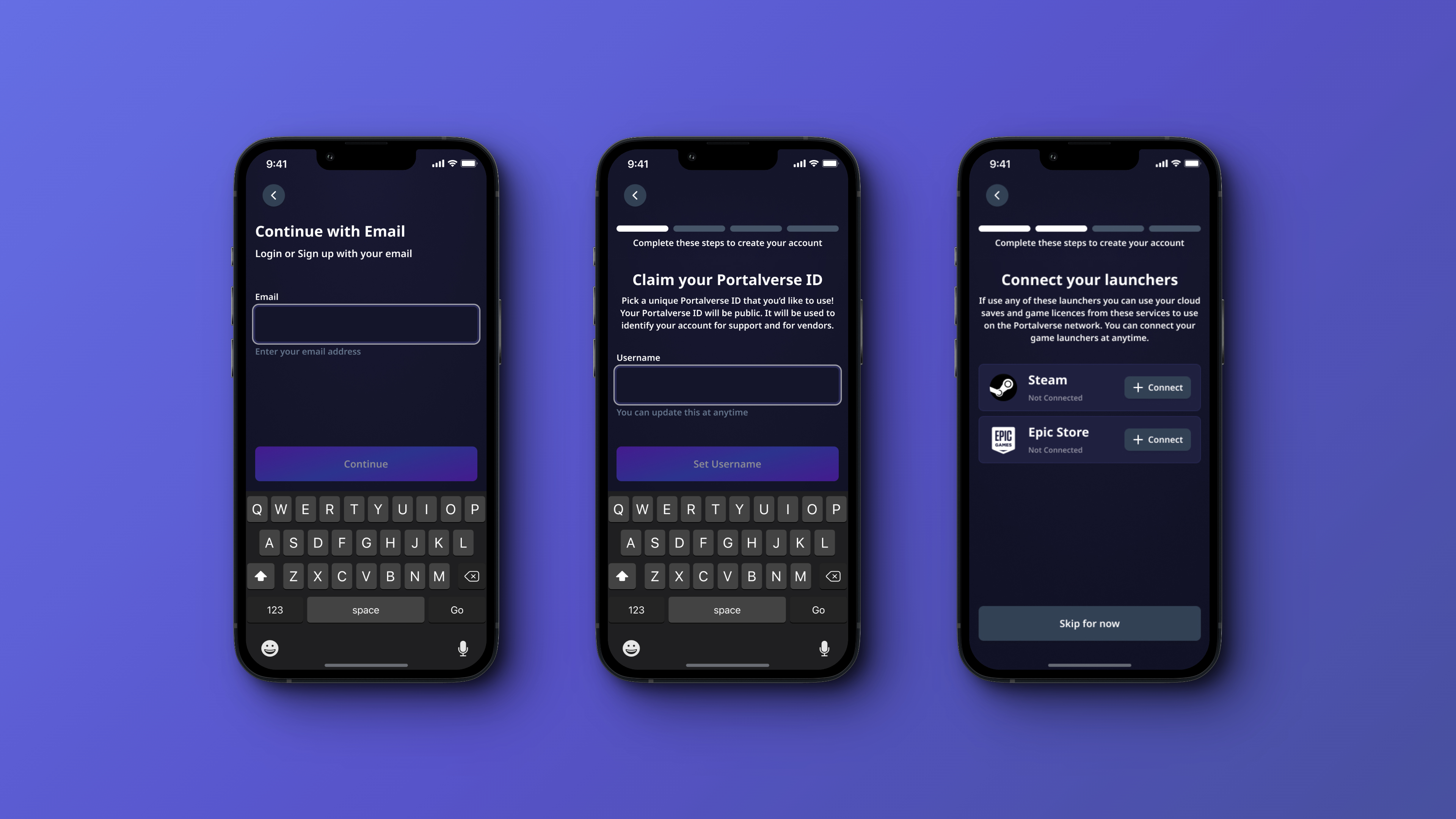
Updated Web2 Experience
Reacting to feedback, we removed core Web3 elements and added commonly requested features:
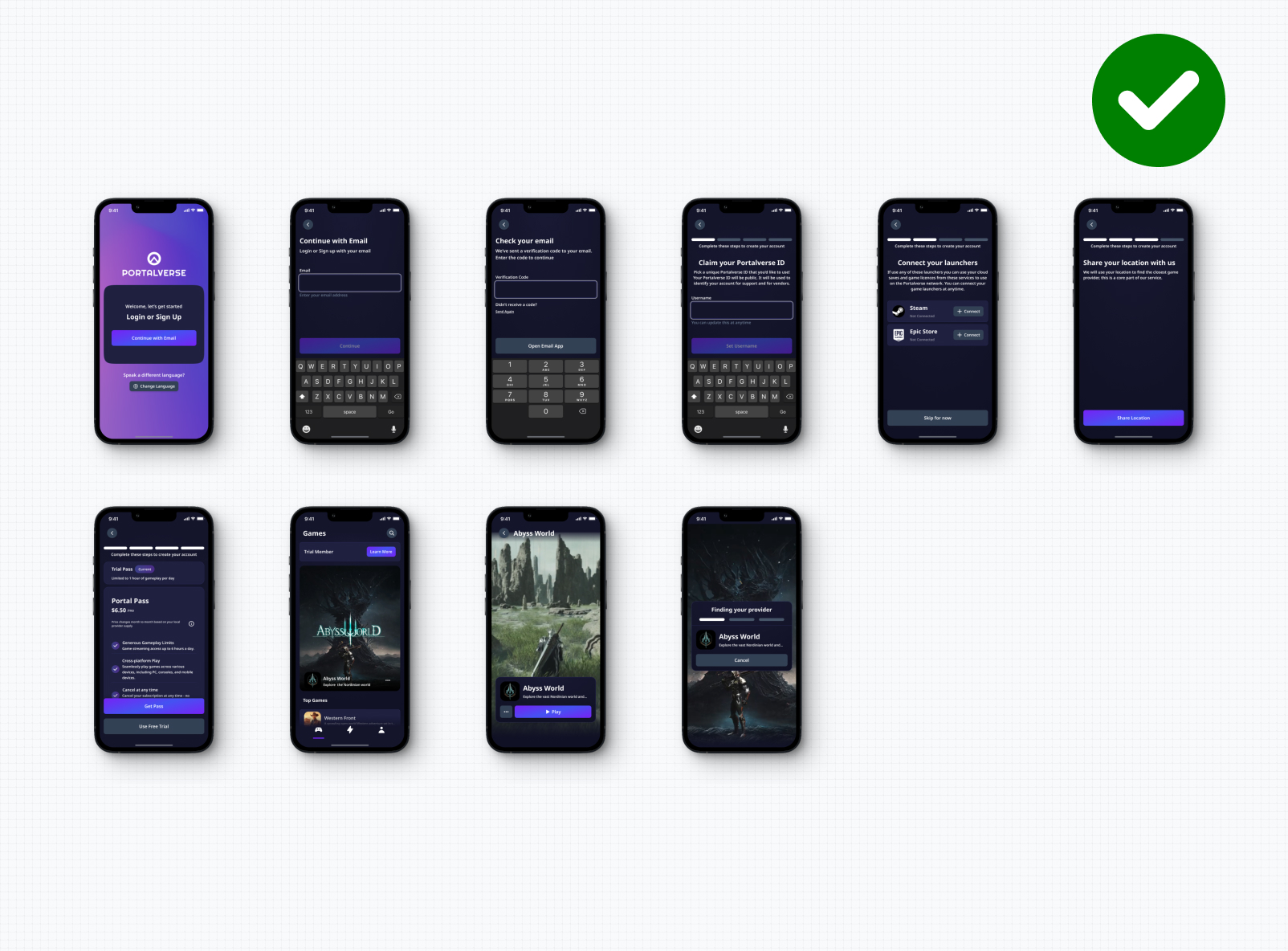
After testing with our users, none required assistance or clarification on how to complete the onboarding.
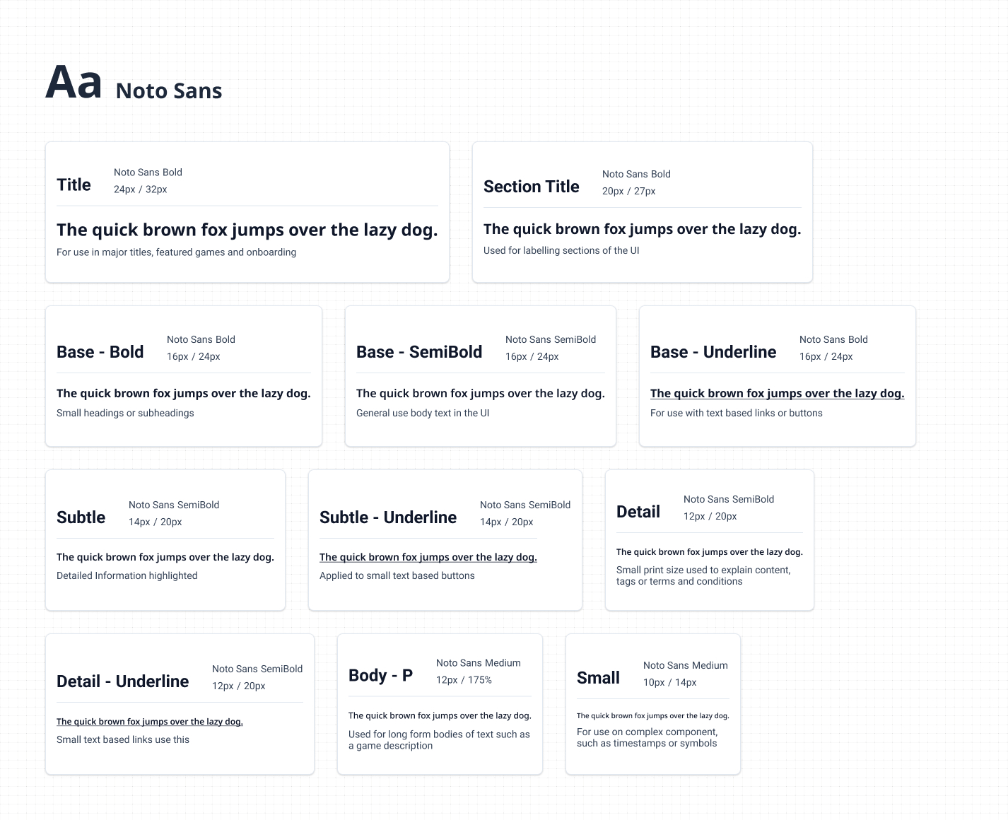
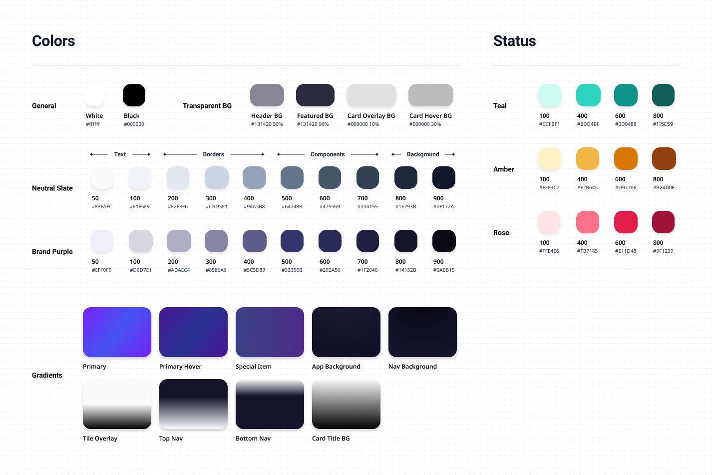
Design System
Localization Challenges
Designing for a global audience presented unique challenges. Our MVP required internationalisation with English and Simplified Chinese at launch, with plans to support Vietnamese, Japanese, and Korean in future releases.
The biggest challenge was typography across different scripts. We needed a typeface that could handle Latin characters, Chinese logograms, and future Asian languages while maintaining visual consistency. I chose Noto Sans because it had comprehensive variants supporting many logographic languages, ensuring our designs remained clean and consistent across different writing systems.
Color choices also needed cultural consideration. While our primary purple reflected the Web3 zeitgeist, we ensured our color system worked across different cultural contexts and maintained accessibility standards globally.
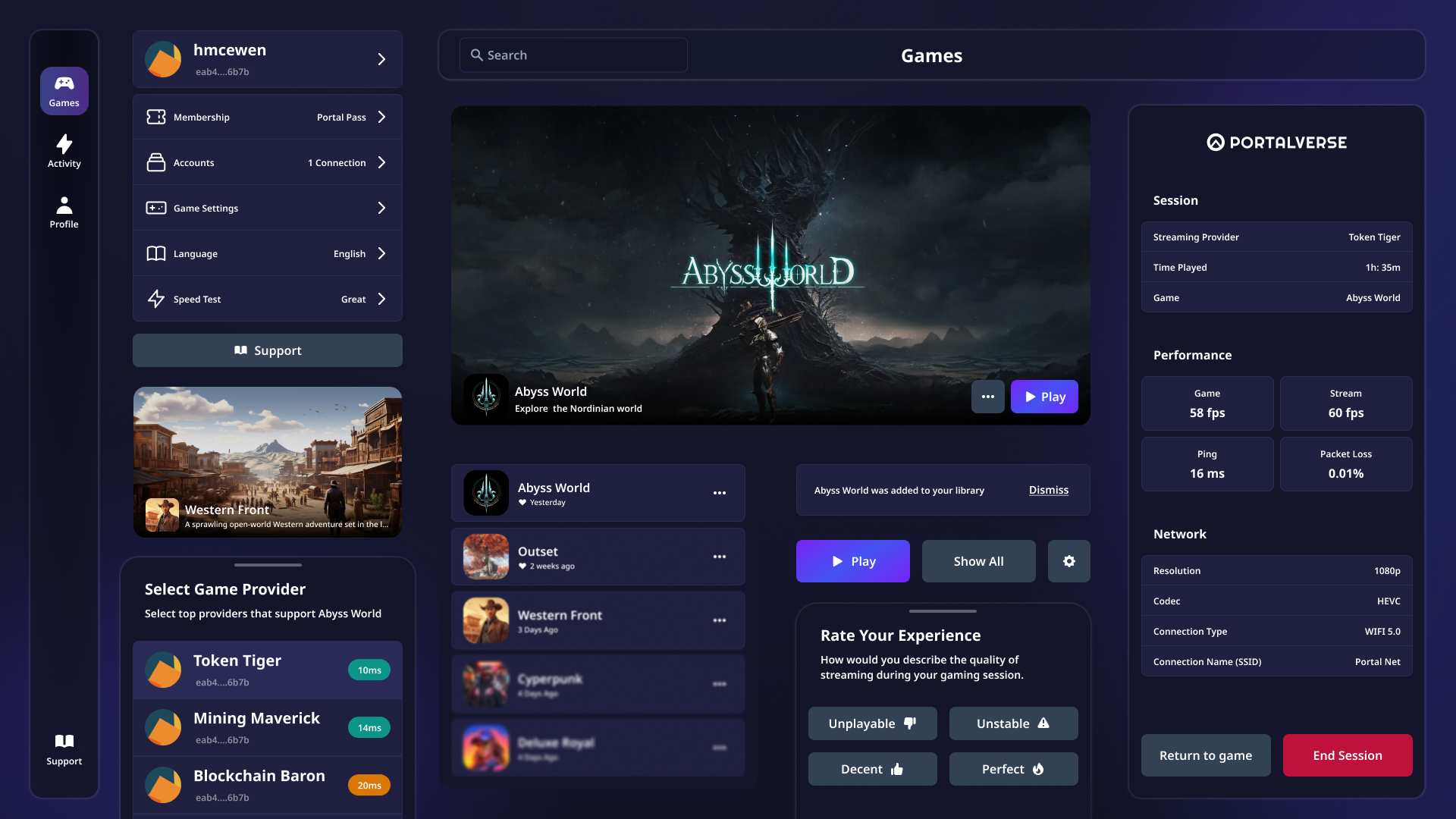
Outcomes
Finally, we arrived at the final design stages, where all of the prior work is blended together to create production-ready designs. Applying my background in front end development, I created designs that incorporated developer technologies and frameworks (Radix UI and Tailwind CSS). My design discipline of incorporating frontend frameworks means that there was little time wasted bridging the gap between design and development, ultimately allowing the service to come to life quickly.
Onboarding
Browsing
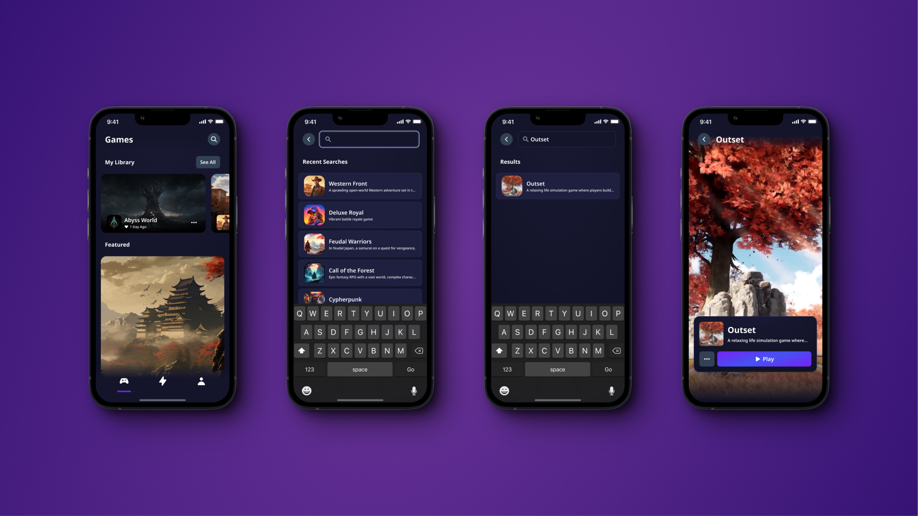
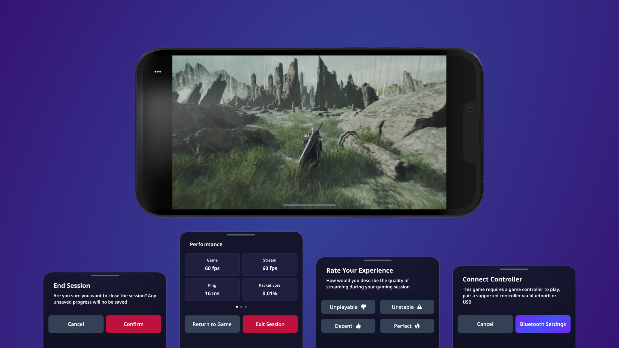
Gameplay
Reflection
What did I Learn?
From the outset of this project, there was pressure to apply Web3 paradigms across the whole consumer application, since we used aspects of Web3 to power our service. But I led us down a different path. I maintained our focus on the quality of the user experience rather than the underlying technology.
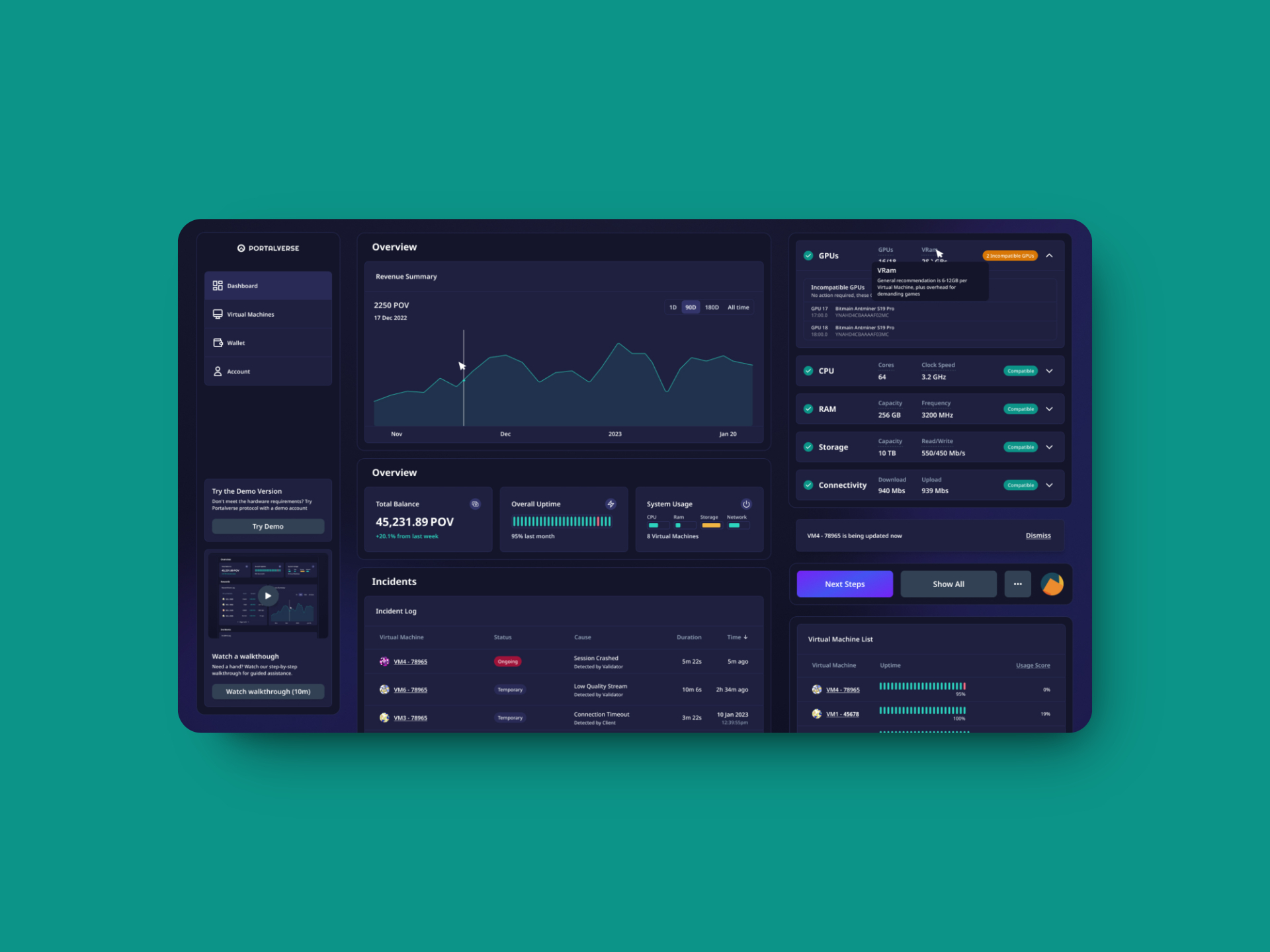
Designing for a two-sided marketplace taught me that different user types require fundamentally different approaches. While consumers needed simplicity and familiarity, our vendor users needed detailed technical information and business insights.
After all, the goal is to provide the best possible service, regardless of whether it involves cloud computing, distributed computer networks, cryptocurrency or any other form of new deep tech.
What I learned time and time again is that new technologies (on their own) don't solve problems.
The Complete Ecosystem
This consumer app was one part of a larger platform ecosystem. Alongside the consumer experience, I also designed a B2B2C platform for cloud streaming providers—the vendors who power the service. This dual-sided marketplace required balancing very different user needs and design approaches.